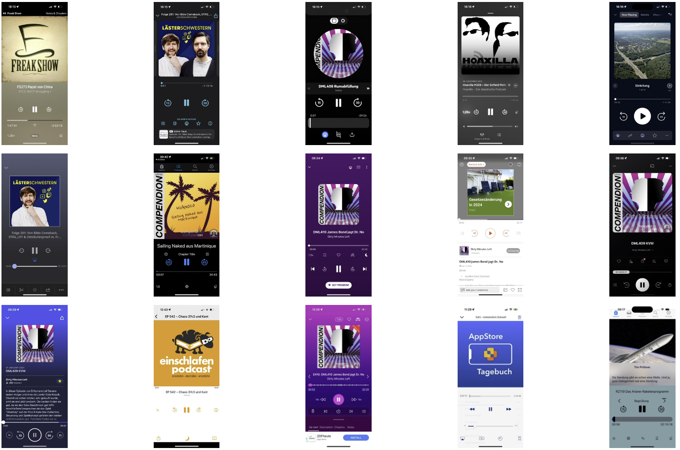
I’m working on a new Podcast app. It all started when my favourite podcast app stopped working. The app relied on a server to work and the company that owned the app (it has been sold in the meantime) was not able to maintain the server when problems occurred. Even basic functions, like exporting the list of subscriptions, were relying on the server connection. As I loved the features of that app and the uncertain future of it made me start developing my own app. As there are already a lot of apps existing, I have the opportunity to compare what other developers are doing and get inspired for my own app.
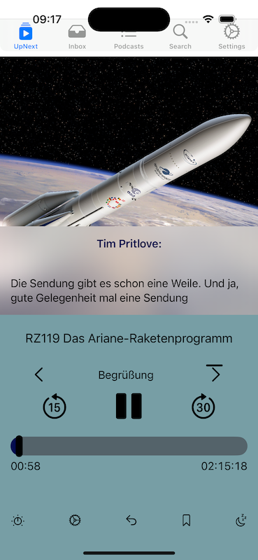
When designing an app, besides selecting the set of features that should be implemented, a big decision ist on designing the user interface. The “play now screen” the screen that shows the player controls when the app is in foreground is one of the most important screens of a player app. Let’s have a look at the new screen I designed for my app. Some items will still change in the future, but I think it’s good to discuss my thoughts when designing the interface:

The now playing screen shows the cover art of the episode on the top. A big portion of the screen is dedicated to this. A lot of podcasters spend time designing and selecting special art for each episode. By giving the cover that much space, I hope the user has a similar feeling as people have when holding big vinyl covers.
The app supports some podlove features. This includes transcripts. If an episode contains a transcript as vtt file. Its content is loaded and can be seen during playback overlayed on the cover art.
The app also supports chapter marks. At the moment of writing this, podlove simple chapters as part of the feed, and mp4 chapters are supported. I’m working on mp3 chapters as well. In addition, some podcasters don’t put proper chapter marks, but list them in their show notes. These are extracted and can be also used to skip chapters. The ‘next chapter’ button contains a progress bar going around the chapter and showing when this chapter is ending.
The duration for the seek forward and backwards buttons are individually adjustable.
The bottom row of icons will be consolidated in the further development. I will explain the function of these icons in a separate posting.
